Brave New World Art Piece
Reflection
1. I chose to do a sculpture because I wanted a 3-D art piece from a scene within the book. I am not a good painter or drawer so I figured those were out of the question. I can work on Photoshop but I would have had some difficulty trying to make a light house proportionate and be able to show depth of field within the light house. A sculpture would give me a chance to work with my hand building something that I could be proud of all the time.
2. Using Unity I was able to show that both the outside and the inside of the lighthouse, even though they are different they unite the idea of a dystopian society. The contrast helped show that the outside (the utopia) stands out rather than blending in with the background. the balance within the lighthouse shows that even though the dystopian is scattered there is balance within it.
3. I don't think I would do anything over. Even though I went through a couple of ideas that didn't work my end product of my sculpture turned out better than I could imagine. I am proud of how my writing piece turned out. The final piece took alot of revisions but to actually read the final product and feel proud is an amazing thing.
Click here to read entire letter
Ancient History Brohure
After learning about ancient art history starting with the Paleolithic and ending with the Acient Egyptians. Afterwards we were given the take to research and create a brochure about a specific topic. I chose to learn about the reat Pyramids of Giza. To create the brochure we used Adobe InDesign which was a completey new rogram that I had no idea to use. After using InDesign I have found tha t is similar to other programs I have used before making it easier to understand.
Pre-Historic Drawing
|
|
All of these pictures are drawn in profile view like the
Paleolithics did. The original drawing was done in our sketch book and scanned into the computer. From there each new picture has a few adjustments to the lines. The picture labeled "threshold" was the only picture adjusted in Photoshop. The rest was adjusted in Adobe Illustrator using the live trace tool. If you look closely each picture is slightly different, mostly in the lines, whether the lines are thicker , thinner, or thick and thin together. |
Stop Motion Animation
Project Reflection
This was an amazing project but was also very annoying. It was hard to keep the camera exactly where you want it and not have the lighting change. The intro and credits were complicated to put together but the end result made the whole thing worth it.
Depth of Field and Lighting Study
Shallow Depth of Field
A shallow depth of field has only one objectin in focus. The rest of the picture is out of focus.
|
Wide Depth of Field
A wide depth of field has every part of the picture in focus. It is as easy to see the far back object as it is to see the closest object.
|
Lighting
Lighting can affect ythe pictures to have a certain mood. The lighting can give a creepy, depressing modd if it is dark or a happy, carefree mood if it light.
|
Book Cover Project
This project tied back to our humanities project. The humanities project was to create a Greek play which included a graphic novel and Greek play script. In Digital Media we were then given an assignment to create a book cover for the play. The book cover needed a title, a background picture, and the author(s).
Book Cover Wrap Up
1.What makes an engaging book cover?
An engaging book cover is something that draws your attention. To create such a book cover there needs to be unity so that every aspect of the book covers works with everything else. The book needs to be able to stand out. This doesn't mean that the book cover has to be crazy it can be extremely simple and still get the same effects. It is better to keep the color scheme simple to many colors can be overwhelming. A basic color scheme and a unified theme creates an engaging book cover.
2. How and Why is art used as a vehicle for communication?
Art is used to communicate because there is no need for a language so anybody can interpret the art work. This can be shown through something simple and to the point or in a complex way. Art can give a feeling for the topic. It can sad and depressing or happy and crazy. By giving the art a mood people have more of an idea on what the topic is.
3.To what extent does a work of art depend on the viewer’s point of view?
To give the proper mood and feeling to the art work the art work must have a certain point of view. To reach the proper point of view the art work must be consistent with the mood. If you want something to feel dark and creepy you would probably have a cloudy night not a bright green field filled with colorful flowers. Different ages like different things within the artwork. To attract a little kid's attention you would want something that looked liked a cartoon instead of something that looks realistic.
How to Videos - Drop-Shadow
For this project we had to watch how-to-videos and recreate the project in Photoshop. I watched a video on how to create a drop shadow. The video made the process look complicated but once I actually did the project it was quite easy. I really like my drop shadow because it seems to be correctly proportioned for the picture. Even though the shadow drops off the page the final product still looks good.
Teacher Animal Poster Project
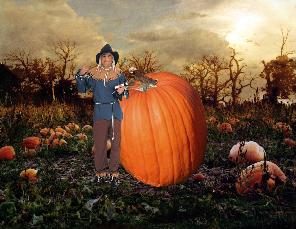
For this project we had to pick a teacher and paste their face on another person, animal, or object. I chose my science teacher Dave Heerschap and placed it on a scarecrow. I liked how the face colors ended up matching. With the nose I had trouble matching the hues but I believe the current skin tone works pretty well. I also like the placement of the pumpkin. The way the stem is pointing helps bring emphasis to the scarecrow.
Name Project
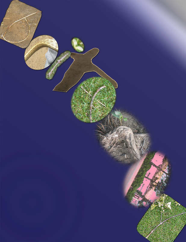
For our first project we were given the instructions to take pictures of natural objects that create the letters of one of our names. I decided to do my first name for the project. I spent one class looking around parks to find my name. The next day in class I started putting all the pictures together to create my name. For each picture I had ton crop and refine them. Sometimes I had to add extra enhancements so the letters could be seen clearly. Once I had finished the letters I started to arrange them on the page so that it would look nice but not be completely cramped. Finally, I worked on my background. I added a gradient so the color fades from purple to black. I also added a very faint rainbow circle to the bottom left hand corner. I like my Name Project because it does express who I really am.
